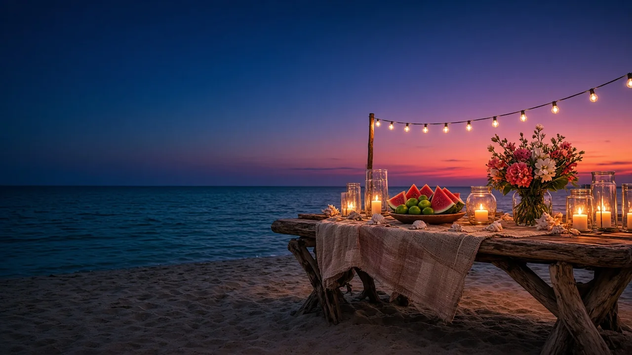
A driftwood table on a beach at dusk with a woven cloth, glass candle lanterns, sliced watermelon and limes, a jar of coral and white flowers and a string of lights, under a deep blue sky with a coral and violet glow over a calm sea.

Beach color palettes, from sand to sea

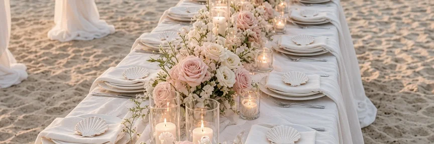
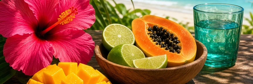
Beach colors from the photos on this page, tuned in Hue42. Pick a look, open its colors and make them yours.

Dusk on the Sand: colors from this photo, tuned in Hue42

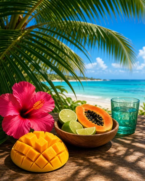
Beach colors are sand and cream, sea-glass green, turquoise and deep ocean blue, with white foam and weathered driftwood gray. Add one warm accent such as coral or a sunset orange, and keep a deep navy or teal for text.

Pick your beach

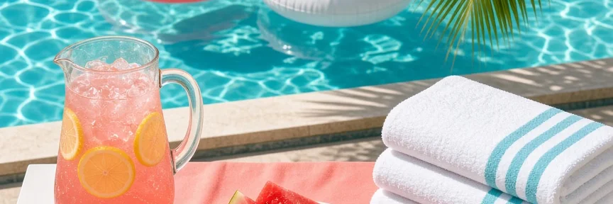
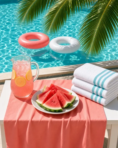
A pool party table beside a bright turquoise pool, with a coral cloth, a pitcher of pink lemonade, sliced watermelon, striped white towels and coral and white floats on the water.

Pool Party

Pool aqua, coral and palm green on a white table, for a summer party invitation or a menu.

#14BBC2 #F56F58 #F8F2EF #254712 #00626A

Hex codes, names and checks
Colors in Pool Party
ColorHexRGBRole
Light Lagoon#14BBC220, 187, 194Base
Grapefruit#F56F58245, 111, 88Accent
Chalk#F8F2EF248, 242, 239Tint
Deep Forest#25471237, 71, 18Anchor
Petrol#00626A0, 98, 106Analog
  • A readable pair. Best text pairing is 9.5:1 (4.5:1 passes WCAG AA).
  • Light to dark range. Lightness spans 61 points of 100.
  • Every color distinct. No two colors are close enough to be confused.
  • Holds up colorblind. Colors stay distinguishable under common color vision types.
  • Room to breathe. There is a quiet color for surfaces and backgrounds.
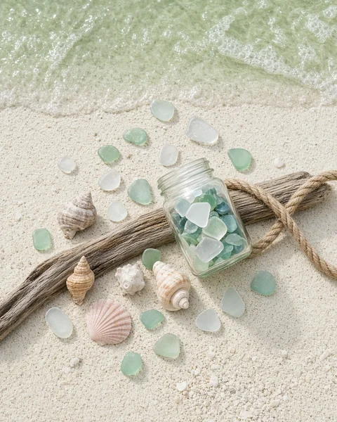
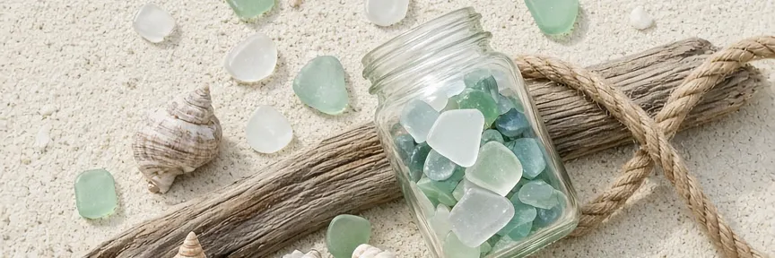
Sea glass in soft green and white on pale sand, with a glass jar of sea glass, spiral shells, a piece of driftwood tied with rope and clear shallow water at the top.

Sea Glass

Sea glass mint and jar green with a shell peach and a deep green for text.

#A9D8BC #6FAE9A #F5EEE0 #E0BBA8 #1D4A3E

Hex codes, names and checks
Colors in Sea Glass
ColorHexRGBRole
Seaglass#A9D8BC169, 216, 188Base
Deep Aloe#6FAE9A111, 174, 154Analog
Linen#F5EEE0245, 238, 224Tint
Muted Melon#E0BBA8224, 187, 168Accent
Deep Spruce#1D4A3E29, 74, 62Anchor
  • A readable pair. Best text pairing is 8.6:1 (4.5:1 passes WCAG AA).
  • Light to dark range. Lightness spans 58 points of 100.
  • Every color distinct. No two colors are close enough to be confused.
  • Holds up colorblind. Colors stay distinguishable under common color vision types.
  • Room to breathe. There is a quiet color for surfaces and backgrounds.
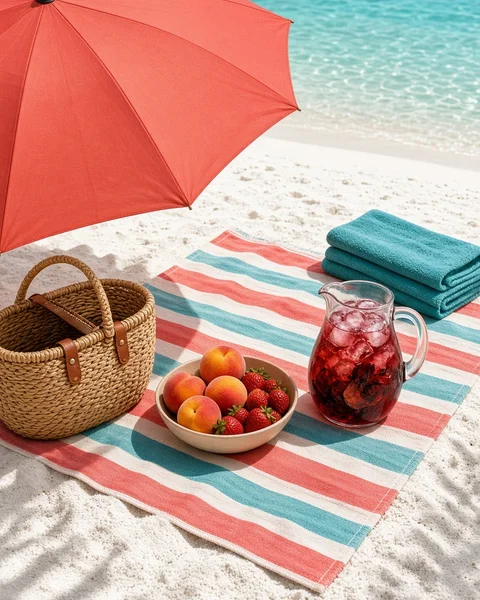
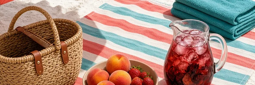
A beach blanket in coral, aqua and white stripes on white sand, with a woven basket, a bowl of peaches and strawberries, a coral umbrella and a teal towel beside turquoise water.

Coral Picnic

Coral, red and aqua stripes from a beach blanket, with a deep teal for text.

#F17263 #CF4234 #6BCAC8 #F9F4EE #004144

Hex codes, names and checks
Colors in Coral Picnic
ColorHexRGBRole
Grapefruit#F17263241, 114, 99Base
Paprika#CF4234207, 66, 52Analog
Muted Turquoise#6BCAC8107, 202, 200Accent
Chalk#F9F4EE249, 244, 238Tint
Midnight Green#0041440, 65, 68Anchor
  • A readable pair. Best text pairing is 10.4:1 (4.5:1 passes WCAG AA).
  • Light to dark range. Lightness spans 63 points of 100.
  • Every color distinct. No two colors are close enough to be confused.
  • Holds up colorblind. Colors stay distinguishable under common color vision types.
  • Room to breathe. There is a quiet color for surfaces and backgrounds.
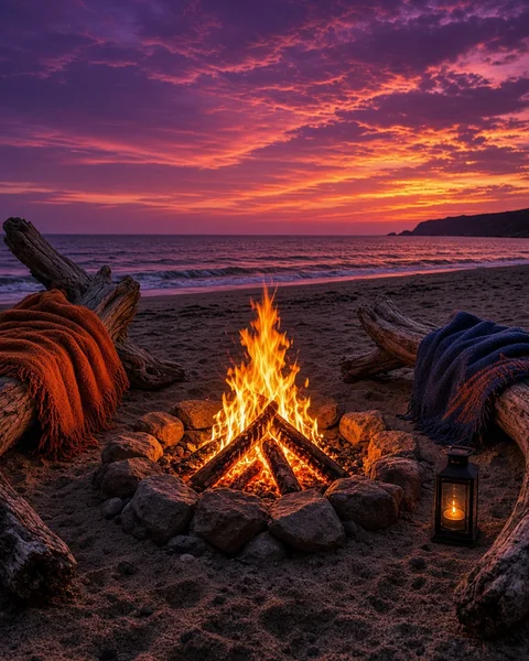
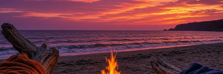
A bonfire in a stone ring on a beach at sunset, with driftwood logs, wool blankets in rust and navy, a small lantern and a sky of purple, magenta and burnt orange over the sea.

Sunset Bonfire

Plum and magenta dusk over the burnt orange of a bonfire.

#311944 #6F4075 #AF4970 #E07838 #FEE1D0

Hex codes, names and checks
Colors in Sunset Bonfire
ColorHexRGBRole
Elderberry#31194449, 25, 68Base
Deep Plum#6F4075111, 64, 117Anchor
Deep Punch#AF4970175, 73, 112Support
Muted Pumpkin#E07838224, 120, 56Accent
Shell#FEE1D0254, 225, 208Tint
  • A readable pair. Best text pairing is 12.4:1 (4.5:1 passes WCAG AA).
  • Light to dark range. Lightness spans 66 points of 100.
  • Every color distinct. No two colors are close enough to be confused.
  • Holds up colorblind. Colors stay distinguishable under common color vision types.
  • Room to breathe. There is a quiet color for surfaces and backgrounds.
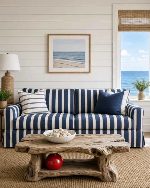
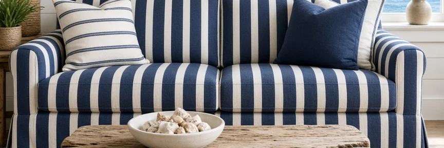
A beach house living room with a navy and white striped sofa, a white shiplap wall, a driftwood coffee table with a bowl of shells, a rope lamp and a window onto the sea.

Beach House

Navy, sky blue and white, with rope and one small red buoy.

#10244D #75AADA #C13D33 #F8F5EE #D1B18E

Hex codes, names and checks
Colors in Beach House
ColorHexRGBRole
Navy#10244D16, 36, 77Base
Muted Cornflower#75AADA117, 170, 218Analog
Paprika#C13D33193, 61, 51Accent
Chalk#F8F5EE248, 245, 238Tint
Tan#D1B18E209, 177, 142Support
  • A readable pair. Best text pairing is 13.9:1 (4.5:1 passes WCAG AA).
  • Light to dark range. Lightness spans 70 points of 100.
  • Every color distinct. No two colors are close enough to be confused.
  • Holds up colorblind. Colors stay distinguishable under common color vision types.
  • Room to breathe. There is a quiet color for surfaces and backgrounds.
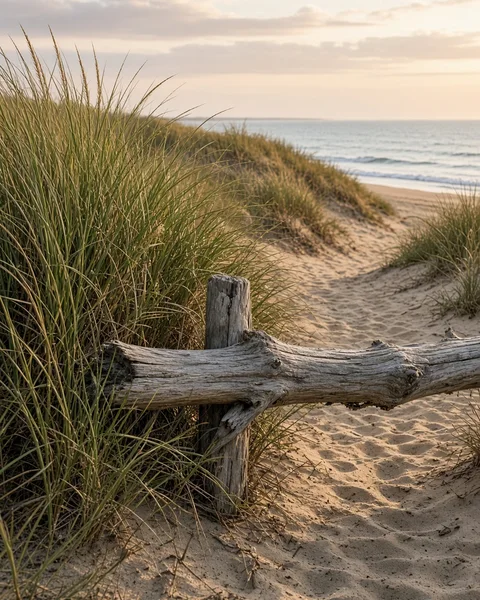
Tall dune grass and a weathered driftwood fence beside a sandy path leading to the sea in warm late afternoon light.

Dune Grass

Dune grass, sand and weathered driftwood gray, a quiet natural set.

#909957 #C5A483 #FEE7CF #7A7065 #332D23

Hex codes, names and checks
Colors in Dune Grass
ColorHexRGBRole
Moss#909957144, 153, 87Base
Latte#C5A483197, 164, 131Accent
Champagne#FEE7CF254, 231, 207Tint
Deep Taupe#7A7065122, 112, 101Neutral
Soil#332D2351, 45, 35Anchor
  • A readable pair. Best text pairing is 11.3:1 (4.5:1 passes WCAG AA).
  • Light to dark range. Lightness spans 64 points of 100.
  • Every color distinct. No two colors are close enough to be confused.
  • Holds up colorblind. Colors stay distinguishable under common color vision types.
  • Room to breathe. There is a quiet color for surfaces and backgrounds.
More beach palettes
  • Dusk on the Sand

    Open in Hue42

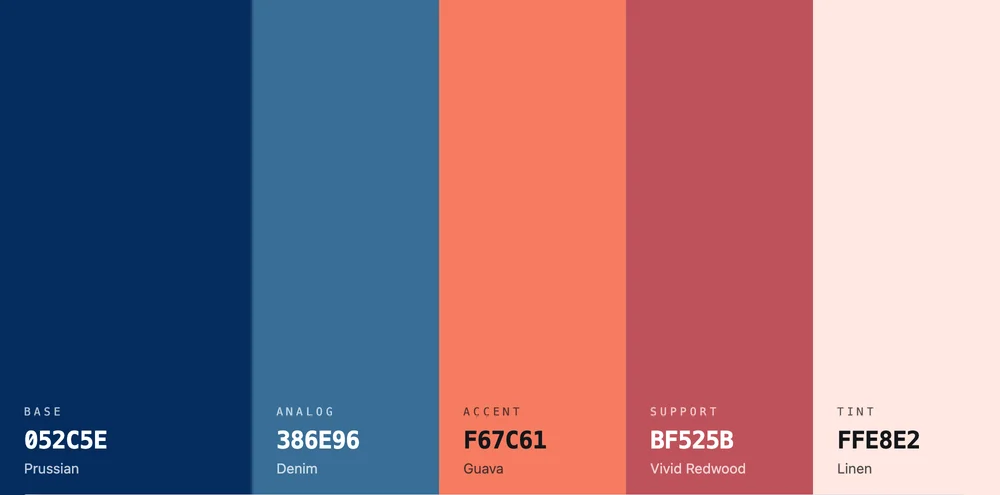
    A dinner on the sand at dusk: deep navy sky, calm teal sea and a coral and rose glow.

    #052C5E #386E96 #F67C61 #BF525B #FFE8E2

  • Sand and Sea

    Open in Hue42

    Sand and sea, for a coastal brand, a surf shop or a vacation rental.

    #0E4D64 #3FA7B5 #BFE3E0 #F2E5C7 #D98F5B

  • Driftwood

    Open in Hue42

    Driftwood grays and browns with a quiet, weathered blue.

    #6B5B4B #A59685 #D9CFC1 #F3EEE6 #3E5C6B

  • Boardwalk

    Open in Hue42

    A boardwalk: weathered wood, sun-faded paint and sea-green.

    #3A4F5E #C8A97E #F0E4CE #D1603D #7BA7A5

Make it yours in Hue42

  1. Start from a photo or a color

    Choose a photo of a shoreline, a room or a swatch you love, or type one color. Hue42 builds a palette from it, and the photo stays on your device.

  2. Keep what you like

    Generate a new palette as often as you like. Lock the colors you want to keep and the rest change around them.

  3. Check it, then copy it

    Every palette gets checks for a readable text pair, color blindness and room to breathe, so a pale sand page still reads. Select any color to copy its hex code.

Open these colors in Hue42
The Hue42 color tool showing a five color palette of deep navy, teal, coral, rose and pale blush, each with its hex code and role.
  • Prussian#052C5E
  • Denim#386E96
  • Guava#F67C61
  • Vivid Redwood#BF525B
  • Linen#FFE8E2

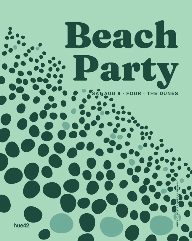
Beach posters, ready to edit

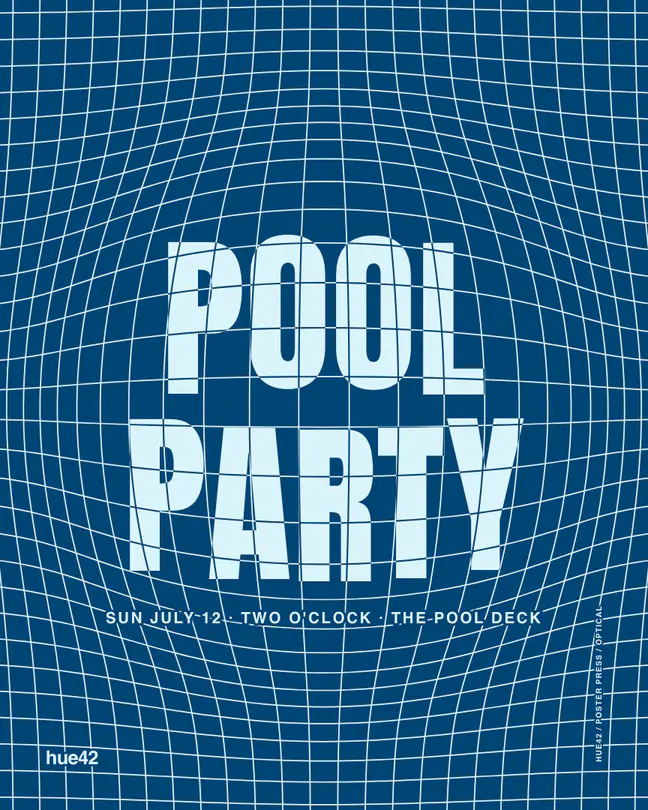
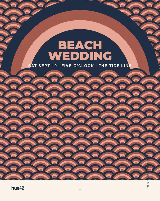
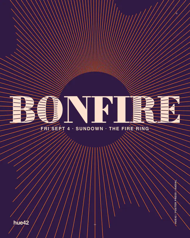
Posters in palettes from this page. The events are made up: open one, put in your own date, time and place, and save it for an invitation or a sign.

More looks

Shop the look

Pool party pack

A pool party in aqua and coral. Floats and towels carry the color, a pitcher and a few melon plates set the table, and palm leaves fill the gaps.

As an Amazon Associate I earn from qualifying purchases.

A short guide to beach color palettes

Why the water has so many colors

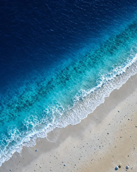
Shallow water over pale sand looks bright turquoise because sunlight bounces off the bottom and back through the water. Deeper water looks navy because there is nothing close behind it to reflect the light.

That is why beach palettes feel natural when they step from pale to deep: sand, then turquoise, then a dark blue. Keep that order and almost any set of shore colors will look right together.

Coastal neutrals do the heavy lifting

Sand, shell, driftwood and sea-foam white are the quiet colors. They can cover most of a room, a wedding table or a web page, and they make the blues and corals look fresh instead of loud.

Sand.
A warm cream or tan for backgrounds.
Driftwood.
A gray-brown for frames, text and furniture.
Sea glass.
A soft green-blue for walls, cards and calm sections.
Deep sea.
A dark teal or navy for text and strong anchors.
One warm accent

Beach palettes are mostly cool, so one warm color brings them to life. Coral, sunset orange, mango and a soft gold all work. Keep the accent to small areas such as a button, a flower or a towel stripe.

Using beach colors without the cliches

Skip the head-to-toe turquoise. Choose two blues, a sand and a single accent, and let the textures, such as linen, rope and wood, carry the theme. For websites, use the pale sand for the page and a deep teal for text, so everything reads clearly in bright light.

Questions people ask

What colors are beach colors?

Sand and cream, sea-glass green, turquoise, aqua and deep ocean blue are the core colors, with white foam and weathered driftwood grays. A warm accent such as coral, or a sunset orange completes the set. Together they echo the shore, from the dry sand to the shallow water to the darker water out beyond.

What colors go well with sea-foam green?

Sand, cream and white are the natural partners, and navy or a deep teal gives it contrast for text. Coral or soft peach adds a warm accent that makes sea-foam look fresher. Light driftwood brown and silver also work. Keep sea-foam as the calm main color and use the other colors in smaller amounts.

What colors should I use for a beach-themed room?

Paint walls in a pale sand, soft white or sea-glass color, then add blue and green through textiles and art. Use natural materials such as wood, rope and linen to carry the theme, and keep one warm accent, such as coral, for pillows or flowers. Pale walls also keep a coastal room bright.

What colors work for a beach event or party?

Sand, white and a mix of aqua and deep blue make a safe base for decor, and coral, sunset orange or yellow give it a festive accent. Use the deep blue or teal for signs and menus, with sand as the background. Light pastels look lovely in daylight but need a dark ink for readable text.

What beach colors work for a website?

Use pale sand or a very light blue-white for the page, deep teal or navy for text and headings, and one warm accent such as coral for buttons. This is calm and easy to read in bright light on a phone. Check that your text colors reach at least 4.5 to 1 contrast against the background.

Are beach palettes only for summer?

No. Sand, sea-glass and driftwood tones are quiet enough to work all year, and a deep ocean palette suits the winter shore. The summer feeling comes mostly from the bright accents, such as coral, turquoise and mango, so swap those for deeper or softer colors when the season changes.

Build a palette from your own shoreline

Open any palette in the Hue42 color tool, swap in the blue or the sand you love and see how the rest adjusts. It shows whether the text on your page or sign will be easy to read.

Open these colors in Hue42

Or pull a palette from a photo of the shore